


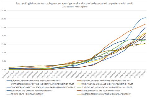
This chart shows the impact of covid-19 patients on each trust’s overall bed-base. It shows confirmed covid-19 patients as a share of the total general and acute beds that were available at each trust in December last year, giving a snapshot on each date.
Most non-acute and specialist trusts are removed.
You can read our interpretation of the latest data here.
THIS CHART IS BEST VIEWED BY DOWNLOADING THE IMAGE OR DOWNLOADING A PDF
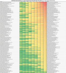
This line chart shows the trend in the share of beds occupied by confirmed covid-19 patients for the 10 trusts most affected this week. It shows a seven-day average, rather than a snapshot on each day, so the figures differ slightly from the heatmap above.
Systems (sustainability and transformation partnerships)
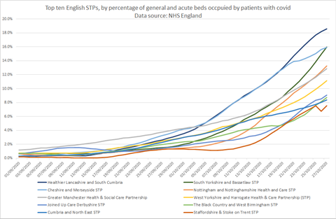
This chart shows the impact of covid-19 patients on each system’s overall acute trust bed base (by sustainability and transformation partnership or integrated care system). It shows confirmed covid-19 patients as a share of the total general and acute beds which were available in December last year, giving a snapshot on each date. Most non-acute and specialist trusts are removed.
THIS CHART IS BEST VIEWED BY DOWNLOADING THE IMAGE OR DOWNLOADING A PDF
This line chart shows the trend in the share of beds occupied by confirmed covid-19 patients for the ten trusts most affected this week. It shows a seven-day average, rather than a snapshot on each day, so the figures differ slightly from the heatmap above.
The charts count covid-19 patients confirmed by positive tests, as reported by NHS England, and are based on NHSE published data. Small differences from last week’s charts are likely due to including/exclusion of non-acute trusts. Let us know if you spot any problems.
TO READ THE CHARTS:
Downloads
System covid occupancy pdf 291020
PDF, Size 1.1 mbTrusts occupancy pdf 291020
PDF, Size 4.9 mb
Source
Analysis of NHSE data
Source Date
23 October
Topics
Liverpool admissions flatten as covid accelerates in Manchester, Yorkshire and Notts
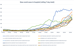
Greater Manchester and West Yorkshire are now seeing the highest numbers of new coronavirus cases in hospital, while Liverpool Cheshire and Merseyside – hit early in the second wave — has seen a drop in new cases in recent days.
- 1
- 2
 Currently
reading
Currently
reading
UPDATED: Trusts with the highest proportion of covid patients


7 Readers' comments