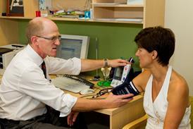
Comparisons of health outcomes around the world are difficult to achieve but increasingly important, argues Ruth Thorlby  

The annual round of comment on the Commonwealth Fund’s rankings took place last week. There are precious few accessible sources of international comparisons, so the Commonwealth Fund’s reports are snapped up with interest by policy makers and the media in the UK.

For those seeking comfort about the state of the NHS, the report delivered. Ranked overall as number one (of 11), the UK was placed in the top three for care processes, access, administrative efficiency, and equity, ahead of many countries who spend more on healthcare.

For those looking for a different story, a story of underperformance and gloom, the report also obliged. On a selection of healthcare outcomes – five year survival from breast and bowel cancer, and deaths within 30 days of hospitalisation for stroke and heart attack – the NHS was ranked second from bottom, out-underperformed only by the United States.

For many years, US policy makers and politicians believed that the US healthcare system was the best in the world, and were stubbornly resistant to reform on the grounds of quality

The report is called ‘Mirror, Mirror’ for a good reason. The Commonwealth Fund has been toiling away since 1998 conducting international surveys and analysing comparative data to inform the policy debate in the United States.

Even though the sample sizes are modest and uneven, surveys such as these add to the evidence base, particularly when they are bolstered by standardised data from the OECD and WHO – which may not be perfect but remain better than most.

For many years, US policy makers and politicians believed that the US healthcare system was the best in the world, and were stubbornly resistant to reform on the grounds of quality. The Commonwealth Fund report authors are well aware of the pitfalls of international healthcare comparisons and especially making rankings out of them.

The consistent underperformance of the United States compared to other wealthy countries revealed in these surveys has played an important role in building the case for change in the US.

The Commonwealth Fund does not aim to hold a mirror up to policy makers in countries other than the US in such an explicit way. Their latest report acknowledges that the UK ranks bottom last for outcomes, but notes that the UK recorded the largest reduction in mortality amenable to healthcare during the last 10 years of any of the 11 countries.

For people familiar with the OECD outcomes metrics used in the Commonwealth Fund report, the “below average but improving” performance of the NHS compared with other countries will not come as a surprise.

Genuine image

In 2016 the OECD published an assessment of the quality of care in the UK, based on analysis of data between 2003 and 2013. The OECD noted that in all four countries of the UK, there was a genuine commitment to improving quality, and from an international perspective the UK is seen as a pioneer in developing and using evidence based guidelines and tools for understanding patient experience, for example.

Despite this, the OECD concluded that UK’s performance against international benchmarks of quality was ‘average or disappointing,’ but also commented that improvements in fatality rates for stroke and heart attack were ‘particularly steep.’

So is this the genuine image in the mirror: a healthcare system that currently lags behind other comparative countries, but is improving in its ability to save lives and relieve illness? A system that has defied financial gravity, and can keep improving healthcare outcomes, while outperforming other systems on other dimensions of quality, such as the absence of financial barriers between patients and care, or low levels of bureaucracy that bedevil insurance-based systems?

Unfortunately, this report is unable to shed much light on the experience of the past three years, when financial pressures have really begun to bite. The UK data used by the Commonwealth Fund to calculate the reductions in mortality amenable to healthcare was from 2013, as were the disease specific mortality rates.

The five year survival rates were from 2008-13. In England, 2013/14 was the first year that the hospital sector recorded a deficit as a whole, and as my Health Foundation colleagues have described, between 2013/14 and 2015/16, hospital provider costs grew by 3.4 per cent while funding grew by 1.1 per cent. These pressures are only likely to get worse.

All eyes will now be on the quality of NHS care. In England, understanding what is happening at a national level, beyond lengthening waiting times, is not straightforward. Clinical outcomes are reported by disease area in the national clinical audits, which have expanded in recent years, but are still limited in their reach.

Complex and messy

Aspects of a national picture can be winkled out of the outcomes frameworks, if you know where to look for them. In terms of public facing data, it is striking that the outcomes data on My NHS are reported only up to 2013. The CQC, in its inspections of organisations, looks at whether data on outcomes are being collected and used to improve care, but does not aim to publish a national picture of clinical effectiveness as a whole.

Perhaps the absence of an accessible national overview can be explained by the energy that has – rightly – gone into generating comparable data at local and regional levels, to drive down unwarranted variation, through programmes such as Rightcare.

But generating a national, or even internationally comparable, picture, however complex and messy from a methodological point of view, on the clinical outcomes of care is still worthwhile, and more important than ever.

Ruth Thorlby is policy director at The Health Foundation.