Close menu
- Home
- Ask HSJ
- Sectors
- Topics
- Local
- Comment
- Interactive
- Events
- Jobs
- All Products
- Subscribe
Map: Which health systems are struggling the most?
By Dave West2016-01-18T07:00:00

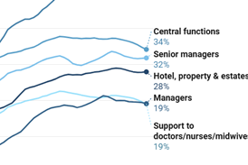
This map shows which health systems are performing most poorly across a range of measures, and two which are performing well, according to HSJ’s analysis.
You need to be a subscriber to read more

Subscribe for unlimited access
With a HSJ subscription you’ll unlock:
- All HSJ news by sector, topic & region
- Breaking News announcements
- App for mobile and offline reading
- Comment and Daily Insights newsletters
- Regional roundup newsletters
- Unrestricted access to ‘Ask HSJ’ - AI assistant - AI assistant
- 10 expert briefings every fortnight (Premium only)
Already a subscriber? Sign into your account here
Part of HSJ Information Ltd. 5th Floor, Aldgate Tower, 2 Leman Street, London E1 8FA. Registered in England and Wales. Company registration 2530185
Site powered by Webvision Cloud


