


Prediction is a mug’s game but let’s grab a calculator and see if we can work out when the 18 week target will be breached across England
“Prediction is very difficult, especially about the future.”
Forecasting is always a tricky and uncertain business, so the first thing to say is that the following forecast is almost certainly wrong. But that doesn’t mean it isn’t worth having a go or that we won’t discover some useful things along the way.
‘The approach I have taken is to study the past for patterns and project those patterns into the future’
The second point to note is that there are many possible ways to do the sums. I chose this method because it is relatively simple and (I think) has the greatest resilience to the errors and complexities inherent in this kind of modelling.
Good lists come in threes, so what’s the third thing? It is crucial to understand that the English waiting list is not a single queue, it is the aggregate of several thousand separate queues: it comprises all the specialties and subspecialties at all the acute hospitals in England.
You can model any one of those queues from first principles by directly taking account of clinical urgency and the practicalities of the patient booking process, which is very useful for planning capacity and managing waiting times in a hospital. But the same approach doesn’t work as well when modelling at an aggregate level. When we are modelling England-wide, the aggregation factor really matters, and we must take a different approach.
Before we get stuck into the details of the modelling, I would like to thank NHS England and in particular their statisticians for some fascinating discussions about modelling at this level, and (less cerebrally) for saving me all the tedious donkey work of adjusting the data for non-reporting trusts all the way back to 2008. But don’t attribute any blame to them if anything here is wrong – this is my analysis and all the mistakes are mine alone.
- Findlay: English waiting list sees its biggest ever August increase
- 18 week waits, August 2015: explore the maps
Death by tweaking
The fundamental approach I have taken here is to study the past for patterns and project those patterns into the future.
What if those patterns change? With this kind of modelling it is very easy to allow tweaks to this assumption and that assumption, until you end up with so many degrees of freedom that you can arrive at almost any conclusion. You also end up with so much complexity that nobody can understand your model.
So I have been ruthless. After looking at the historical patterns by eye – the trend changes and seasonal variations – I took a judgement that the last three years of data (September 2012 to August 2015) paint a pretty consistent picture and I have based all my projections on them. The only tweaking I have allowed is the growth in activity; everything else is clamped to the patterns of the last three years.
‘A big decision was how to link waiting lists with waiting times’
The other big decision was how to link waiting lists with waiting times. There are lots of possible ways of doing this, and I decided to take the simplest approach I could think of that would capture changes to the dynamics of this highly aggregated waiting list, and cope well with growth in the waiting list and consequently in waiting times.
The measure I picked was the ratio between the average waiting time and the target measure (the 92nd centile waiting time). I further decided to calculate average waiting times indirectly using Little’s Law, because that method is unaffected by changes in the order in which patients are treated, so this ratio should be a relatively clean way to capture those changes.
Now that we have outlined the overall principles, we can step through the method.
A measure of the method
The spreadsheet model itself is available here so you can examine the detail of everything that follows. The main calculations are in the “analysis” worksheet, and the side calculations and cross-checks are in the others. If you find any glaring errors, please comment on this post or let me know directly.
1. Ratio of average to 92nd centile waiting time
The first step is to calculate the Little’s Law average waiting time, which is equal to the size of the waiting list divided by the average rate of clock starts.
The list size is available from the published data (after adjusting for non-reporting trusts).
‘There has been a clear seasonal variation, with waiting list management being best from April to October and worst in winter’
The average rate of clock starts is not yet available in the published data, so we need to estimate it. We can’t back-calculate it from the published data either because a critical piece of information is missing (the number of patients removed for reasons other than clock-stop); this information is not expected to be collected nationally for some time yet.
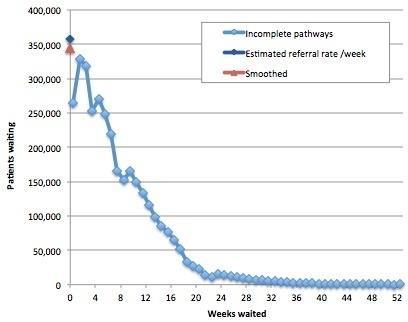
So we can only estimate clock starts, by looking at the waiting list and interpolating the cohorts back to the axis to estimate the rate of arrival on the list with zero time on the clock. There is a further problem, which is that the shortest waiting cohorts are commonly underreported because of delays in entering patients onto hospital IT systems. By eye, I reckoned that the best results were obtained by interpolating based on the >1-7 week cohorts.
Finally, we need the average clock start rate, and (again by eye) I reckoned that smoothing over four months struck the best balance between preserving the seasonal and trend variation, while filtering out the worst of the noise. You can play with the numbers and come to your own conclusions using the worksheet “Test interpolate referral rate”; an example is shown in the chart below.
The second step is to measure the 92nd centile waiting time. This can be done directly from the published data (see worksheet “92pcwait”).
Now we have both the numerator and denominator, and we can calculate the ratio. All three series are plotted in the following chart and the ratio (the orange line, plotted on the right hand scale) tells a fascinating story.
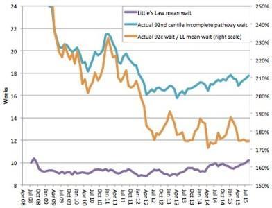
Crudely speaking, the orange line is a measure of the quality of waiting list management and resource allocation, and lower means better (up to a point). The more that patients are treated in date order, and the better that resources are allocated around the NHS to even out waiting time pressures, the lower this ratio will become.
(I say “up to a point” because it is possible for this ratio to become too low, for instance, if clinically urgent patients are being delayed on a mass scale in favour of long-waiting routine patients, but that is a topic for another time).
So the broad picture is that waiting list management improved steadily up to the general election in spring 2010, deteriorated as the new coalition government flirted with relaxing enforcement of the targets and then tightened up again when they realised that was a mistake.
At the end of 2011 the new 92nd centile incomplete pathways target was announced, which triggered a rapid improvement in waiting list management, and those gains have been protected ever since. The picture has been pretty stable since late summer 2012, which is why I have started my historical analysis then.
In the last three years there has been a clear seasonal variation, with waiting list management being best from April to October and worst in winter – a fascinating result in its own right.
There is also some continuing trend improvement, but it is rather small despite the high profile amnesty and abolition of the perverse completed pathway targets. I have assumed that both the seasonal variations and the small trend will continue into the future (and both are analysed in the worksheet “92c over LLmean trends”, where LL is short for Little’s Law).
2. List size consistent with 18 week breach
Now that we know the expected ratio of average to 92nd centile waits into the future, the rest is fairly straightforward.
The next thing we need to know is the size of waiting list that is consistent with achieving the target. If the real waiting list is smaller than that, then all should be well. If it’s bigger, then we can expect a national breach of the target. We can work this out in two steps.
First, if the ratio is equal to the 92nd centile wait divided by the Little’s Law average wait, then we can work out the Little’s Law average wait that is consistent with the 92nd centile being exactly 18 weeks: it’s simply 18 weeks divided by the ratio.
Second, if the Little’s Law average wait is equal to the size of the waiting list divided by the average rate of clock starts, then the size of waiting list is equal to the Little’s Law average wait multiplied by the average rate of clock starts.
So the size of waiting list consistent with 18 weeks is then equal to the Little’s Law average wait when the 92nd centile is 18 weeks (which we just calculated) multiplied by the average rate of clock starts (which we worked out above).
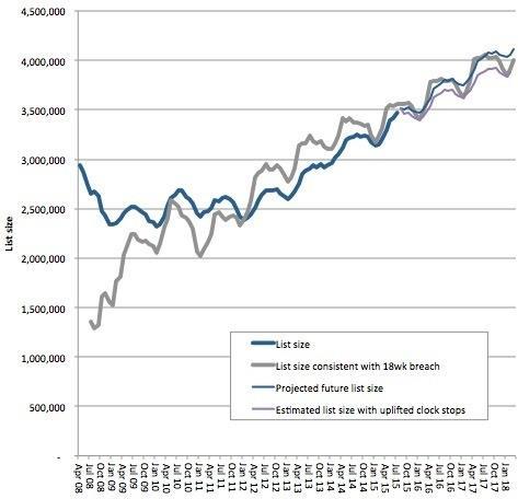
That gives us the list size consistent with a borderline 18 week breach.
3. Projecting the future size of waiting list
The only other thing we need to work out is the projected waiting list size in the future, for comparison against the “borderline breach” list size.
The worksheet “List size trends” takes the last three years of waiting list data, extracts the trend growth and seasonality, and uses them to project into the future. That gives us our baseline scenario.
We also want to know what the waiting list would be if activity were to increase or decrease. If we assume that total clock stops (including patients who are removed from the waiting list without a recorded clock stop) are proportional to activity, then we can estimate the number of clock stops by back-calculating from the other data and then applying growth to that.
The basic formula for balancing waiting list movements is: additions to the list equals activity plus other removals plus growth in list. So we can rearrange that into: (activity plus removals) equals additions minus growth in list. Because we are working with monthly data, but have waiting times in weeks, this becomes: (activity plus removals in a month) equals (clock starts per week multiplied by weeks in the month) minus (growth in list size in the month).
We can then uplift our baseline figure for “activity plus removals” by our chosen growth rate, project it forwards into the future and then work out the resulting list size based on how much extra activity we are laying on compared with the baseline scenario (ie, in addition to recent trends).
Well done if you waded through all that – but don’t worry too much if you didn’t bother. Now, let’s see what the results are.
A breach is forecast
The key results are:
- If everything carries on like the last three years, then England is projected to breach the 18 week referral to treatment waiting time target in the December 2015 figures, which are due be published in February 2016.
- Activity needs to increase by a further 3.24 per cent above recent trends to avoid breaches over the next few years.
‘A breach of the 18 week target is due unless something can be done to arrest the growing backlog’
As far as I am aware, nobody in the NHS is currently expecting activity to increase by as much as 3.24 per cent in the coming year, let alone to do that on top of existing trends. Nevertheless, in the charts below, the purple line shows what would be expected to happen if it did, and if that growth had already been underway since the beginning of September.
Firstly, here are the total projected list sizes, showing how the actual waiting list size has been approaching, and is set to exceed, the breach level.
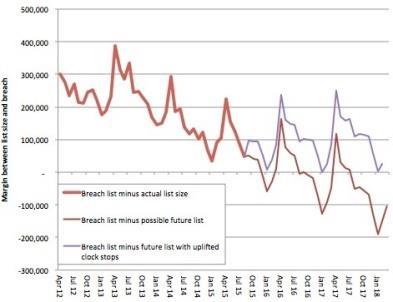
It is quite hard to see exactly what is going on when the lines get close to each other, so here is a chart showing the difference between the projected list sizes and the breach level.
Longer waits
Longer queues mean longer waits and the queue in England has been growing rapidly.
A breach of the 18 week target is due, possibly in the December 2015 figures (which are due to be published in February 2016), unless something can be done to arrest the growing backlog.
An increase in elective activity of at least 3.24 per cent annually, on top of existing trend growth, may be required to avoid any future breaches of the 18 week target nationally.
Rob Findlay is founder of Gooroo Ltd and a specialist in waiting time dynamics


4 Readers' comments