


Need a forecast of your referral to treatment profiles for 2018-19? Look no further.
The following analysis is available by trust and specialty, right across England. The complete set of profiles is published on Tableau Public here.
I’ll start by looking at the analysis itself, and then explain some of the quirks you will want to watch out for.
Profiles for a long waiting service
Let’s take an example. The profiles below are for a particular ENT service that currently has long waiting times. The top two charts show that if you kept up with demand (the green line), the waiting list and waiting times would finish up at the same level as they started, as you would expect. This is the scenario that NHS England and NHS Improvement are particularly keen you should deliver.
There are two other scenarios on the charts. The grey line shows that if this service continued to deliver last year’s activity rate, then the waiting list and waiting times would continue to grow. Finally, the pink line shows that a reduction in the waiting list and waiting times would be needed to get this long waiting service back to 18 weeks RTT.
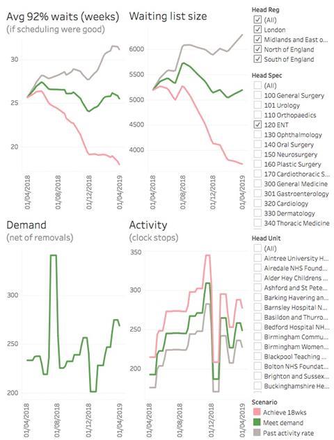
So, what about the bottom two charts? They show why the waiting list and waiting times are rising or falling.
The bottom left hand chart indicates demand (clock starts), and demand is the same under all three activity scenarios. The numbers are based on the real seasonal profile of clock starts seen over the last two years; in this particular service, there tended to be a surge in clock starts in July, and a slump in December.
The bottom right hand chart shows activity. The highest activity is needed in the scenario that achieves 18 weeks (because this requires a reduction in the waiting list size), and lowest in the scenario that continues at the past activity rate (which in this case means further growth in the waiting list). We have assumed 15 per cent removals other than activity (there is no published data about this), and generally if activity exceeds net demand then the waiting list will fall.
Again the seasonal profile is based on what happened in the last two years, and this trust has evidently been going for pre- and post-Christmas surges to cope with the holiday shutdown. (And if you are wondering why the demand and activity charts look blocky, it is because the published RTT data is only available monthly.)
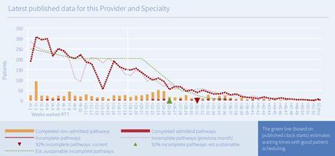
The starting waiting times in these profiles broadly tie in with the RTT reports that we publish every month, and the chart below shows the snapshot for this particular service at the end of March 2018. The green triangle below shows the best RTT waiting time that could be expected if there were good patient scheduling; at 25-26 weeks, it matches the starting point in the top left hand chart above. A fuller explanation of these snapshots is available here.
Profiles for a shorter waiting service
For the example above, I chose a service with quite severe waiting time pressures. However, when you browse the data you will notice that many services don’t follow the same pattern.
For instance, the charts below show a service that currently has short waiting times, is already broadly keeping up with demand, and where good patient scheduling would allow the waiting list to grow and still sustain 18 weeks.
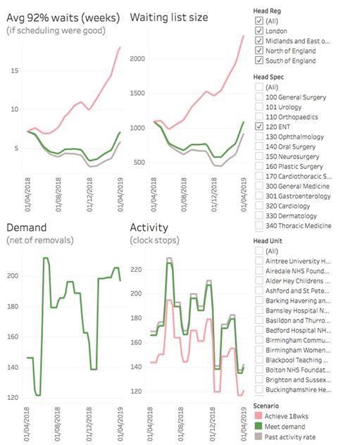
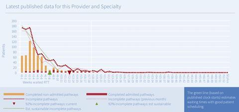
This conclusion is consistent with the green triangle in the snapshot below. As is usually the case, this trust’s real-life waiting times are somewhat longer than that (as shown by the red triangle). So, you may find it helpful to think of both the green triangle in the snapshot below, and the “if scheduling were good” lines in the profile charts above, as representing the best waiting times that could be achieved at the safe limits of good patient scheduling.
Things to watch out for
This is RTT data
The published waiting list data in England is on an RTT basis, so that is the basis we have had to use in this analysis. Serious demand and capacity planning would usually be conducted for each stage of treatment separately (new outpatients, elective inpatients, etc), but we would have needed access to each trust’s local data to populate the model on that basis.
If you would like to compare this analysis with your own stage-of-treatment plans, be aware that it can be fiddly to reconcile stage-of-treatment data with RTT data because of inconsistencies around non-consultant-led activity, diagnostics and follow-ups.
The data isn’t complete
We have excluded any local specialties that either have small waiting lists or small volumes of activity, or where any data is missing over the past year. That adds up to quite a lot of excluded data, which is why the total waiting list for these charts is smaller than the published waiting list for England.
It assumes zero growth
Your own planning profiles will have used local assumptions about how fast demand is growing. For consistency, we have applied zero annual growth in demand across all services, which is broadly in line with the national planning assumptions.
It is based on recent seasonality
The seasonal profiles for these forecasts are based on the average of the last two years of actual clock start and clock stop data for each service. Your local demand and capacity plans may have used different seasonal assumptions; for instance you may have assumed a different amount of elective slowdown in the final quarter.
You can aggregate, but waiting times will be averaged
The filters in the Tableau Public charts allow you to select multiple services at the same time - indeed when you first visit the page everything is selected. This works well for the waiting list size, demand, and activity because they are counts of patients and they add up nicely.
However, it doesn’t work so well for waiting times, because waiting times don’t add. So, I have set Tableau Public to show the average of the selected waiting times instead, which can sometimes look surprising because those averages don’t necessarily come out in the same order as the total waiting list sizes.
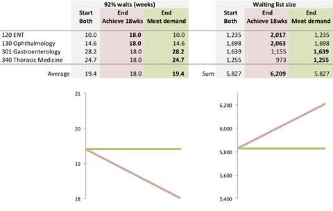
I’ll illustrate with a worked example. The figure below shows four specialties in the same trust, and although each individual specialty behaves as expected, the aggregate does not.
For instance, if you look at ENT, you can see that waiting times rise from 10 weeks to 18 weeks under the “achieve 18 weeks” scenario, which is a longer waiting time than if they remained steady under the “meet demand” scenario. If you look at the waiting list size, it also gets larger under the “achieve 18 weeks” scenario, as you would expect.
The other three specialties also behave this way, when you look at them individually: the scenario with the longer final waiting time is also the scenario with the larger final waiting list.
However, when you aggregate them, something surprising happens. The scenario with the longer average waiting time (meet demand) is not the scenario with the larger total waiting list (achieve 18 weeks). That’s just how the arithmetic works, and it is an artefact of averaging the waiting times.
The moral is: when you are aggregating several different trust-specialties, take the average waiting time with a pinch of salt.
All profiles are based on the published RTT data and the forecasts were generated using Gooroo Planner. The raw data going into and coming out of the modelling is downloadable from Dropbox here and could be used to replicate this analysis.
Dr Rob Findlay is director of the software company Gooroo, specialists in demand and capacity planning


No comments yet