


Issues with the friends and family test’s validity and data interpretation means patients may be unable to make informed decisions about where best to have treatment, say Rachel Davis and Eleni Panagiotopoulou

The friends and family test has been praised by the government. It says it can drive up standards by giving patients a stronger voice to decide if their healthcare is good enough
The friends and family test has been praised by the government. It says it can drive up standards by giving patients a stronger voice to decide if their healthcare is good enough. The real value of the test to the NHS is debatable and criticisms of it have been well documented.
‘No explanation is provided on the Choices website as to how the headline metric is calculated despite relevant policy highlighting the need to do this’
Research commissioned by the Care Quality Commission and carried out by the Picker Institute in 2012 concluded that the test was “not appropriate for use in an NHS setting”.
- Ciarán Devane: How to make the NHS Constitution a reality on the front line
- The friends and family test is much more than a target
- Chris Graham: The friends and family test works best if we forget about scores
Individuals misunderstood and objected to the term “recommend” (for example, “Why would I recommend bladder cancer?”; “It would be stupid to recommend a hospital based only on the doctors I have seen”) while others criticised it for implying patients have a choice, which is often not the case, particularly for emergency admissions.
The test’s adoption of the net promoter scoring methodology has also been branded by the general public as overcomplicated, not intuitive and misleading. This, together with inconsistent methods of data collection, mean test findings both within and across hospitals may not even be comparable.
Question of intepretation
Aside from the issues with the validity of the test, which is also of concern, but much less understood, is how the test data is interpreted by patients and the general public. Since one of the aims of the test is to help patients make informed choices about healthcare providers, it is vital that the data is presented in a way they can understand. Since July, test results have been published monthly on the NHS Choices website but critics of the test say the results are likely to be misleading and confusing.
Hospitals were initially categorised as “best”, “worst” or “OK”, with seemingly absurd cut-off points. Some hospitals were ranked worst even though more than 90 per cent of patients recommended them, while others were ranked best despite data only being collected from three people (a 0.1 per cent response rate).
‘The general public and patients cannot even begin to accurately interpret the value of the data’
While this ranking system has now been removed from NHS Choices and is under review, the test data remains. No explanation is provided on the site as to how the headline metric is calculated despite relevant policy highlighting the need to do this. In addition, no information is provided on the range of scores the test score can fall within, which is -100 to +100. Without knowing this, what does a “score” really mean?
To address this issue, we examined how easy it would be for a group of highly educated adults to interpret the test headline metric as displayed on NHS Choices. We focused on a group of undergraduate students, reasoning that if they found the data difficult to understand, the wider general public would too.
Based on results from 104 students, we found that none were able to accurately understand the meaning of the test headline score. Many (57 per cent) simply said they did not know, another 40 per cent misinterpreted the data and 3 per cent refused to answer the question, saying the way the data was presented was “ridiculous”, “annoying” and “impossible to make sense of” (see table, below).
| How people interpreted the data | No. of responses |
|---|---|
| Don’t know/don’t understand/have no idea/have no clue! | 57 |
| 61 out of 290 patients are inpatients | 16 |
| 61 patients, out of 290 asked, completed the test/the survey | 11 |
| A bad response, only 61 were satisfied | 3 |
| 61 patients out of 290 are happy with the hospital | 2 |
| 61 out of 290 patients shared the same opinion on the hospital | 2 |
| Ridiculous! Insufficient information for me to know! | 1 |
| 61 from 290 scored within the normal range | 1 |
| The data needs explaining – I am annoyed, I cannot make a judgement on this! | 1 |
| Very unclear data and impossible to make sense of | 1 |
| 290 patients completed the test, of which 61 were correct | 1 |
| 61 scores were positive and 290 were negative | 1 |
| How many patients know about the FFT | 1 |
| 25% of patients think the hospital is bad | 1 |
| 61 out of 290 patients rated the care of inpatients | 1 |
| What the score actually means: The hospital scored 61 out of a maximum of a 100 on the FFT based on feedback from 290 inpatients. | |
When students were shown the breakdown of raw test scores by response category to see if this improved understanding of the test score (see table, below), all correctly said the data related to the number of patients that would recommend a hospital. However, not one student was able to make sense of how the two datasets, the headline metric and the raw scores, related to one another or how the headline score was calculated from the raw data.
| How people interpreted the data | No. of responses |
|---|---|
| The majority of patients recommend the hospital | 80 |
| The hospital is good and patients would be very happy to recommend it | 14 |
| 145 patients would be extremely likely to recommend the hospital and very few would be unlikely to recommend it | 4 |
| Over 95% are happy and would recommend the services at the hospital | 2 |
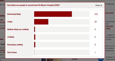
| What the data actually means: 145 patients would be “extremely likely” to recommend the hospital, 36 would be “likely”, 6 would be “neither likely nor unlikely”, 3 would be “unlikely” and 1 would be “extremely unlikely” | |
Unintuitive, complicated and confusing
Our findings show that the way the test score is presented on NHS Choices is unintuitive, complicated and confusing. This, taken together with the poor face validity of the question, means the general public and patients cannot even begin to accurately interpret the value of the data in reflecting the actual quality of care at a hospital. Patients may or may not recommend a hospital based on reasons completely unrelated to their care.
‘While the commitment to listen and learn from patients’ accounts should be acknowledged, the test could do more harm than good’
While the test does give patients the option to provide qualitative feedback on their chosen response, such as why they answered “extremely likely” or “extremely unlikely”, no mention of this information is provided on the Choices website.
In addition, unless data collection for the test can be standardised both within and between hospitals – for example, one method of data collection and minimal deviation from the 15 per cent expected response rate – it is impossible for anyone to know whether differences in scores among hospitals are real or simply the result of methodological disparities. Worryingly, this could result in patients making misinformed decisions about where is best for them to undergo treatment: the exact opposite of one of the aims of the test.
- Friends and family test ‘unreliable’ comparison tool, in-depth study concludes
- Chris Graham: The friends and family test works best if we forget about scores
Plans to extend the use of the test across the whole of the NHS are already underway, but in light of the criticism, it is debatable how useful (if at all) this data is not only to patients and the general public, but also to providers and commissioners.
While the commitment to listen and learn from patients’ accounts should be acknowledged, especially in the aftermath of the failings at Mid Staffordshire Foundation Trust, the test could do more harm than good.
Given the lack of scientific evidence to support it, we would argue that the test is not going to have the revolutionary effect on healthcare that the government hopes for, serious consideration should be given as to whether we should even be asking the question to patients in the first place.
The Picker Institute’s research found that a much more reliable patient experience indicator would be to ask patients to state: “overall I had a very poor experience” to “overall I had a very good experience”, on a scale of 1 to 10.
One test is not enough
However, we think that no single metric, even one which is scientifically robust can unravel the complex interplay of transactions that determine patients’ experiences of healthcare. A test score can only reflect the proportion of patients with a positive or negative healthcare experience. It provides no insight into the reasons behind the number or how healthcare services could be improved.
While the test’s implementation guidance acknowledges this and highlights the need for hospitals to conduct follow-up questions, no fixed requirements are placed on how (or how much) hospitals should do this so the process is likely to be variable.
However, for those hospitals that do elicit further feedback, positive changes to services have been made. Following patients’ complaints about noise and light at night, Hillingdon Hospital introduced a “comfort at night” campaign, including changing waste bins to silent-closing models and setting standard times for dimming lights.
This suggests the real value of the test is not in the question itself but in the qualitative approaches utilised to understand how services can be made better. Making it a mandatory requirement for hospitals to capture and report back on this type of feedback could shift the focus from ranking hospitals, based on incomparable data, to focusing more on what really matters: how to improve patient care.
Rachel Davis is a senior research associate and Eleni Panagiotopoulou is an honorary research assistant at Imperial College London


3 Readers' comments