


For the previous 10 years, analysts Listening into Action have produced a scatter map based on NHS staff survey results, plotting trust ‘performance’ and ‘trend’.
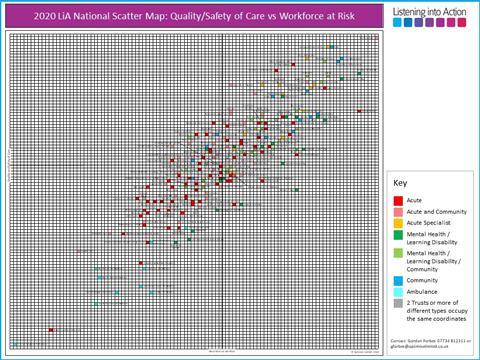
This year, a new LiA scatter map shows “quality and safety of care” on the y axis, with “workforce at risk” on the x axis. The analysis is based on the appropriate elements of the relevant staff survey categories, including quality, safety and teamwork for “quality and safety of care”; and morale and staff engagement for “workforce at risk”.
Positions for all NHS providers are shown on one page.
This new scatter map means it is possible for:
- All 230 NHS trusts to be compared as a whole and not segmented into cohorts or different types of trusts;
- Responses to be ranked from best to worst, or safest to least safe, or strongest culture and leadership to weakest; and
- Readers to determine which trust is doing well and which is not, based on the quality and safety of patient care at each trust, and how staff feel.
The rationale for the analysis is that for staff to deliver a good service, trusts must support and enable staff to deliver that care.
There is a distinct correlation between the mappings of the two axes — if staff rate the quality and safety of care, they are almost certainly also going to respond positively about the state of the work environment and how they feel. The latter appear to be an enabler for the former.
The scatter map should be read as follows:
- The higher the trust’s placement, the better the quality and safety of care in comparison with others, according to its staff.
- The further to the right a trust is, the more it is likely to have a stable, supported and enabled workforce.
Downloads
LiA scatter map
PDF, Size 0.12 mb
Revealed: The trusts which will struggle most to deliver quality care in 2020

The trusts which are likely to face the fiercest struggle to deliver quality care in the immediate future have been identified through an analysis carried out exclusively for HSJ.
- 1
- 2
 Currently
reading
Currently
reading
Illustrated: How every trust fares on ‘workforce’ and ‘quality’ risk ratings


10 Readers' comments