


The quality and safety of patient care the system delivers depends on the wellbeing, morale and sustainability of frontline staff members. By Gordon Forbes
Over recent weeks, NHS leaders have been poring over their detailed 190-page benchmark reports, trying to make sense of what their staff said as questions, themes, graphs, bar charts, trends and more data than you could shake a stick at are presented in “standard format”.
Most are none the wiser.
Here’s an excerpt from a board paper I read yesterday from one trust:
“The results of the national NHS staff survey 2019 have now been published. The survey took place in September/October 2019. The trust had a 50 per cent response rate, which is a record high response rate for the trust. There was a positive upward movement in the majority of responses compared to 2018, but the trust is still some way off reaching the average for [our cohort] trusts. Although the improvement is welcome and the responses seem to indicate that the trust is going in the right direction, there is a considerable amount of work to be done.”
In reality, this trust is:
- Below average on 52 out of 54 key findings;
- Below average in all 10 themes in the survey;
- In the bottom 20 trusts nationally (out of 229 trusts) for six out of the 10 themes; and
- Way, way down in the bottom left quadrant where staff rate them a long way below average on “quality and safety of care” and “workforce at risk” `
And yet the sense a board/EMT would get from the papers presented is that, “We’re doing okay”. Our national analysis spells out quite clearly that they’re not. It’s a common response across the NHS, and we see similar in many trust board papers every year.
This matters. It’s why staff feel the way they do, and how they feel impacts patient care every day.
The way the NSS results are presented does not help leaders grasp the realities, and it makes comparative assessment across the NHS very difficult. We hope the new LiA Scatter Map will prompt a fresh view of the results and enable a more dynamic response at national and local level.
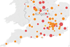
National Quality and Safety of Care Scatter Map
We have pored over the latest data, looking for a new view of the results which will form an irrefutable basis for change — which is what the NHS needs and staff are asking for.
And the answer became clear — get back to basics.
The purpose of the NHS is to “improve the health and wellbeing of patients, communities and its staff through professionalism, innovation and excellence in care”. That’s why we are all here. It is everything. So, let’s turn data into information, into knowledge, into wisdom — in a way that is instrumental to that goal.
The new view is a National Quality and Safety of Care Scatter Map based on what staff are saying. This is a first for the NHS:
- 230 NHS trusts can be compared as a whole and not segmented into cohorts or types;
- Responses can be ranked from best to worst, or safest to least safe, or strongest culture and leadership to weakest;
- Crystal clarity on who’s doing well and who’s not, based on things that really matter — the quality and safety of patient care at each trust, and how staff feel working there; and
- A way for local leaders — and national we hope — to actually do something about it.
Last week, we had a conversation with a super local CEO, and helped them to understand how to translate ”We’re just about average” and “We’re about the same as last year”, into something that managers and staff can actually do something about. That, after all, is the point of asking 1.4 million hard-pressed staff to tell us what they think in the first place. They want and need us to do something — and that doesn’t just mean tweaking an appraisal form or two!
How the new Scatter Map works
The new LiA Scatter Map plots the “quality and safety of patient care” staff feel they are able to offer on the vertical axis, against a “workforce at risk” on the horizontal axis.
The rationale for the analysis is clear. The quality and safety of patient/service user care is the primary goal of the NHS.
For our staff to deliver to patients, we have to deliver for them. The goal of all leaders at every level must, therefore, be to prioritise ensuring that staff have the best possible work experience and support to deliver the best possible care to patients, relatives and the public as a whole.
Nothing matters more than this.
So, while the vertical axis focuses on quality and safety of care, the horizontal axis shows how staff rate their work environment and the support they get to do the job they all want to do. The result is a set of “workforce at risk” numbers that point to the likelihood (or not) of workforce stability and continuity challenges adversely affecting the care a trust’s key assets are able to deliver in the year ahead.
There are similarities in format to the previous LiA Scatter Maps which focused on “performance” vs “trend” — a concept that was well-received but perhaps too generic to be a real game-changer.
- It is a 2x2 matrix with “average” or “mean” lines to highlight where the above/below thresholds kick in;
- Each trust is plotted on the grid against each axis and colour-coded by type;
- A “scatter” of trusts presents a picture of how all trusts of all types compare nationally; and
- A reading of “best to worst” from top to bottom and then right to left, row by row.
There are some major differences though:
- All trusts on the map can be read as one cohort (staff responses are judged on the one set of thresholds, not different ones for each trust type);
- There is only one quadrant you want to be in, and that’s top right: above average for quality and safety of patient care according to staff rating you and your leadership, and with the most positive workforce across the system in relative terms; and
- There is a distinct correlation between the mappings of the two axis — if staff rate the quality and safety of care they are able to provide as high, they are also likely to respond positively on the state of the work environment and how they feel. This is borne out by the lack of trusts in the top left and bottom right quadrants, with a linear scatter appearing most pronounced.
Headlines from this analysis
The first and most obvious takeaway is stark — as well as known, if not universally practiced. If you look after your staff, everything else will look after itself. Make a hash of this and all sorts of travails await.
Delving into the detail for a second, it’s shocking to see the range of responses from staff to some of the themes:
- The response rate from staff across trusts varies from 27.2 per cent at the lowest to a 76 per cent high. Why? And what does it tell us about how staff are feeling at the low end?
- Quality of appraisal responses see a low of 18.8 per cent (!) to a high of 44.3 per cent; four in five at its lowest, to a best of less than one in two staff rate the difference their HR sessions have on how well they do their job and how valued and developed they feel — so that’s an awful lot of people doing an awful lot of things all year, every year, for not a lot of benefit according to staff.
- Bullying and harassment responses see a best case where “only” 13 per cent feel they have been subject to some sort of bullying from patients, managers, or colleagues, to a high of almost one in three (don’t know what to say).
- And morale according to staff varies from 46 per cent feeling okay, up to 70 per cent at its high; leaving 30 per cent to 54 per cent not terribly happy, I guess.
And so to the new LiA Scatter Map itself. A journey from Northumbria to East of England — not an easy trip in reality, nor in NHS terms.
The standout trust according to staff this year is Jim Mackay’s up in the North East. Not a massive surprise given their perennial showing in the upper reaches of how staff rate leadership and culture, but getting there and staying there are two separate and distinct challenges. So, congratulations to Jim and the team at Northumbria Healthcare Foundation Trust, rewarded handsomely for their 76 per cent staff response rate this year. It’s a fair bet that if you get this sort of response to your NSS request, you’re doing a lot right.
At the other end of the scale is East of England Ambulance Service Trust, by some distance it has to be said. Not only are EoEAS at the bottom of the Scatter Map, but staff responses to the NSS puts the trust bottom (229 out of 229) for six themes, and second bottom for another three. They’re not there by chance on the Scatter Map.
In between, there is so much to reflect on and digest to make a series of ready-make explanations and conclusions, but here’s a first attempt:
The cream has risen to the top, as we would expect, with trusts who have done well in recent years continuing to get a good press from their staff: Liverpool Heart and Chest, the top acute specialist trust; Kent Community top-dog in MHLDCOMM land; Northamptonshire Healthcare continuing their good work around ED&I representation on a far wider footing for staff; Royal Bournemouth and Christchurch winning top accolades from staff in the acute sector; and Dudley and Walsall scooping more recognition for mental health and learning disability trusts this year following on from last year’s improvements.
Recognition from staff is a habit, it would appear.
There is a preponderance of mental health, learning disability and community trusts in the top right, competing with, as to be expected perhaps, the acute specialist trusts.
Towards the other end of the scale, the size of the challenge and the particular pressures of working in an acute setting are overly represented in the bottom left. Ambulance staff have the toughest gig — or is that rig? — as we know, but surely something must be done nationally to help this beleaguered sector back towards the rest of their colleagues? We’re all part of one system after all.
There are some trusts that stick out. Particularly in the acute sector and the acute and community sector. Being an outlier is never a good place to be. So it’s time for drastic action to turn things around. There will no doubt be lots of reasons and explanations flying as to “why we’re where we are”, and by and large, “that’s what we’d expect”. If I had a quid for every time someone has told me “we’re different”, I’d be retired by now. Except you’re not really.
For every trust leadership team and board who has a challenge around a recent merger, a new management team, a change in chair, a huge patch to cover, a scandal to react to, or whatever, there are several — if not many others — who’ve had the same issues and challenges facing all trusts and who thrive and prosper according to staff nonetheless.
In conclusion
So, check out the big picture. Find out where you are and what staff feel about the quality and safety of care they can provide or the environment they have to work in, and resolve to build on your success and/or address the challenges staff say the system gives them. There’s lots of mileage in doing the former. There’s no prospect in the year ahead of not doing the latter.
A good start would be to screw your courage to the wall, and share the Scatter Map with your board and EMT at your next public meeting, not the sanitised versions fed by the report formats trusts receive, nor the local leadership’s spin on what staff say. The answers to the challenges you face, supported by the national system leaders we’re sure, are hiding in plain sight.
If staff retention and recruitment are mission critical to the NHS this year — when we’re already 10-12 per cent down — then it’s not really optional. Apparently, the quality and safety of patient care the system delivers depends on the wellbeing, morale and sustainability of frontline staff members.
But then we knew that already, didn’t we?


Topics
- Acute care
- Community services
- DUDLEY AND WALSALL MENTAL HEALTH PARTNERSHIP NHS TRUST
- East Of England Ambulance Service NHS Trust
- Jim Mackey
- Kent Community Health NHS Foundation Trust
- Leadership
- LIVERPOOL HEART AND CHEST HOSPITAL NHS TRUST FOUNDATION TRUST
- Mental health
- Northamptonshire Healthcare NHS Foundation Trust
- NORTHUMBRIA HEALTHCARE NHS FOUNDATION TRUST
- Patient safety
- Quality and performance
- Specialist care
- Staff wellbeing
- THE ROYAL BOURNEMOUTH AND CHRISTCHURCH HOSPITALS NHS FOUNDATION TRUST
- Workforce
Revealed: The trusts which will struggle most to deliver quality care in 2020

The trusts which are likely to face the fiercest struggle to deliver quality care in the immediate future have been identified through an analysis carried out exclusively for HSJ.
- 1
 Currently
reading
Currently
reading
What does the NHS staff survey really tell us?
- 3


1 Readers' comment